Tigers Jaw
For my first project of the Google UX Certification, I was tasked with designing a concert merchandise app for an indie rock band.
The product: Tiger’s Jaw is an indie rock band that wanted to give their fans a way to access/purchase concert merch when they were unable to attend shows, and also reward their biggest fans with exclusive drops.
Project Duration: September 2023 - October 2023
The problem: Fans are not always able to attend shows due to geographic, financial, or scheduling reasons, but still want access to the merchandise sold at the shows.
The goal: Give fans the ability to easily purchase concert merchandise from their phone that is shipped directly to their location.
My Role: UX Designer designing the app from conception to delivery.
The goal: Give fans the ability to easily purchase concert merchandise from their phone that is shipped directly to their location.
User Research Summary: I conducted interviews and created empathy maps to understand the users I’m designing for and their needs. A primary user group identified through research was working students/adults that don’t have the time to go to shows. Research also revealed that user problems included living outside of major cities where concerts take place and inability to afford tickets.
User Pain Points
TIME
Users did not always have the ability to fit attending a concert into their busy schedule.
LOCATION
Users often did not live near major cities or where shows were being played and did not have the ability to travel.
MONEY
Users often couldn’t afford ticket prices, or the cost it would be to travel to venues.
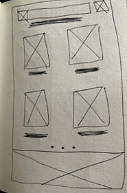
Paper Wireframes
Taking the time to draft iterations of each screen of the app on paper ensured that the elements that made it to digital wireframes would be well-suited to address user pain points.
.jpeg)
.jpeg)
.jpeg)
.jpeg)
.jpeg)
Low-fidelity Wireframes
As the initial design phase continued, I made sure to base screen designs on feedback and findings from the user research. Easy checkout was a key user need to address in the designs in addition to equipping the app to work with assistive technologies.


Low-fidelity Prototype
You can view the low-fidelity prototype here.

Usability Study: Findings
I conducted two rounds of usability studies. Findings from the first study helped guide the designs from wireframes to mockups. The second study used a high-fidelity prototype and revealed what aspects of the mockups needed refining.
Round 1 Findings
1
Users want to remove items from the cart
2
Users want the band logo to link to the homepage
3
Users want to have accounts for exclusivity + ease of payment/shipping
Round 2 Findings
1
Users wanted clearer headers
2
Users wanted username/password reset buttons
Mockups
We added the ability to remove items from the cart, as well as added a total cost number to the bottom so the user could know how much they were paying before committing to checkout.
Before Usability Study

After Usability Study

In the second usability study, users didn’t feel like the headers of the page were noticeable, so we updated them to pop more and allow them to know exactly what page they were on.
Before Usability Study

After Usability Study


Takeways
Impact
The app makes it easy for users that don’t have previous tech experience to complete an order successfully, while also being able to support the band they love.
One quote from peer feedback:
“I do most of my shopping online, but this app really made the transition so easy. I love that I’m able to order items from my phone!”
What I learned
While designing the Concert Merch app, I learned that the first ideas for the app will never completely cover everything. Usability studies and peer feedback influenced each iteration of the app’s designs for the better.


.png)
